¶ Overview
Use the Historical Intersection Timing Report (for short, referred to as the ”HIT” report) to view detailed information on the second-by-second performance of a particular intersection The HIT report can be displayed as:
- A printed report
- A time-series of cyclic performance
- A histogram of phase durations
Second-by-second phase status information is returned for all intersections throughout the agency that are connected to ATMS on communication lines with sufficient bandwidth. Each change is time-stamped to the nearest second. The ATMS system stores this detailed information for every connected intersection for the past 30 days. The report data can be stored in the database or as a flat file. This allows for easier management and access to HIT data, as well as easier creation of separate reports. This detailed information includes:
- Changes to phase interval for all phases on each ring (green and clearance; changes from yellow to red are not returned by the field controller)
- Changes to plan number (including flash and free)
- Changes to plan mode (coordinated, transition, preemption)
- Loss of communications
- Anomalies in poll frequency
Due to the volume of data necessary to record this information, information older than seven days is overwritten by the system.
To view this information, select the Historical Intersection Timing menu item from the Reports | Intersection Performance menu. The following user interface display will be displayed.
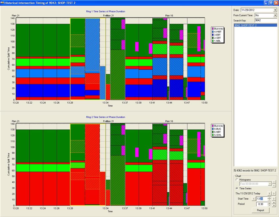

A cross hatch pattern and label indicates the time at which preemption started and a single hatch pattern and label indicates the time at which a transition started. Any period of time that has no data will show a yellow hash pattern. The image below shows an example of an intersection that did not have any hit data available for a full day.
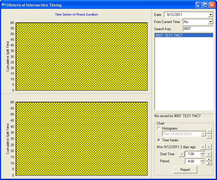

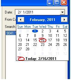
The top right section of the screen allows you to select the date for which the HIT data is retrieved from the data repository.
Use the drop down box to choose a different date.

The interface also allows the user to choose data from 15 minutes, 30 minutes, 45 minutes, 1 hour, and 2 hours prior to the current date and time. This allows quick analysis of reported field problems.
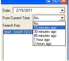
To select a specific date, ensure that ”NO” is selected in the quick-select drop down box.
The next section below the day selection area allows you to select the intersection of interest. The top entry field allows you to search the database for a given string. Asset numbers and intersection name strings can both be entered as string search keys like other KITS selection dialogs. To select a given asset, click on the item in the selection display which will be highlighted in blue.
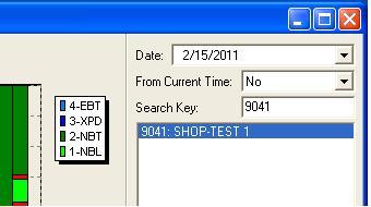

Below the list of assets in the selection dialog, the system will indicate the number of records (data points) available for the selected asset for the selected time frame. If there are no records available, ”no records” is displayed for that asset when selected.
If any records are available for the selected asset, a histogram or a time-series graphic is displayed in the left-hand side of the window, depending upon which is selected in the Chart section. The phases in the HIT graphical display are displayed in the order in which they ran in the cycle. In addition to the basic phases, the HIT graphical display also supports xped (exclusive ped) phases.

If no records are available, the status bar below the list of intersections will indicate ”no records”.
The report selection dialog allows users to easily select from the 30 days worth of data. The following Time Range selections are available:
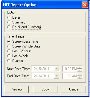
| Time Range Selection | Description |
| Screen Date Time | only the data that is visible will be generated for the report |
| Screen Whole Date | all of the data in the Date picked will be displayed, regardless of the time picked on the graphical display |
| Last 12 Hours | Quickly pull up the last 12 hours of data for the report |
| Last Week | Quickly generate the report for the last week of data |
| Custom | Select a custom date and time from the Start Date Time and End Date Time options |
An additional feature of the HIT graphical display is that the phases are displayed in the order in which they ran in the cycle.
¶ Printing and Exporting Data

The available report and export options are:
| Option | Description |
| Detail Only | Prints or exports only the second-by-second detailed information on the selected asset |
| Summary Only | Prints or exports only the summary information on the selected asset |
| Detail and Summary | Prints or exports both the detailed information and summary information for the selected asset |
| Screen Date Time | Selects only the data that is visible |
| Screen Whole Date | Selects all of the data in the Date picked regardless of the time picked on the graphical display |
| Last 12 Hours | Selects the last 12 hours of data |
| Last Week | Selects the last week of data |
| Custom | Select a custom date and time from the Starr Date Time and End Date Time options |
For each of these three options, you can select to:
- Print a report
- Export the data to the Windows clipboard
¶ Printing a report
To print a report of the data, select the preview button. A printed report uses the KITS standard report format. The Header of the report contains:
- Intersection location (short names 1,2,3)
- Asset ID number
- Start date and time of the report
- End date and time of the report
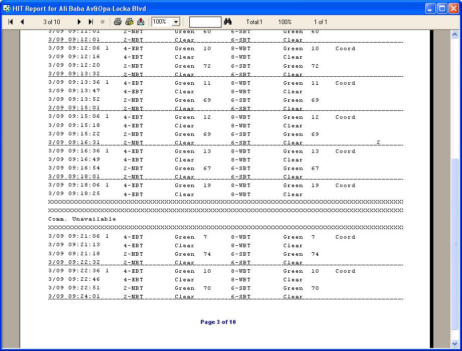
As shown in the example above, a line is drawn across the report at the start of each cycle and rows of x's are shown if communication was "unavailable" during a period of time. "Unavailable" can mean either there was a communication failure or the communication server was being restarted.
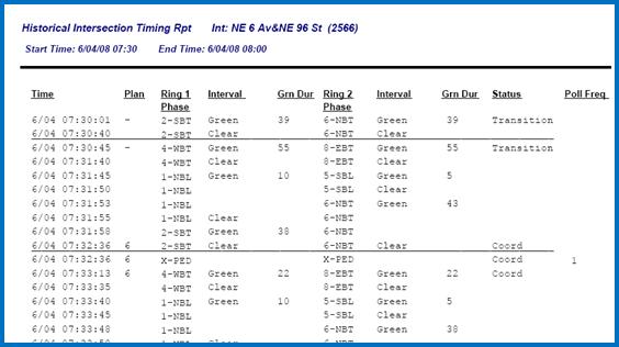
As defined by an agency , the ”r;start of cycle” is defined as the crossing of the second barrier.
| Data Column | Description |
| Time | The time stamp for this event; shown in military time |
| Plan | Lists changes to the plan ID number. Transition is shown as ”r;-”r;. Preempt, Free, and Flash are written out. Plan numbers are printed in the report at the start of each cycle (or approximate cycle) or when the plan number changes. |
| Ring 1 Phase | Lists changes to the phase number for phases in Ring 1 (Phases 1,2,3,4). The phase number and phase mnemonic (if configured on the intersection definition form) are listed in this column. XPED is also shown in the column. XPED is determined to be occurring (since this status is not returned in the basic phase timing message from the controller) based on a clearance time than lasts longer than 10 seconds. |
| Interval | Lists changes to the phase interval for phases in Ring 1 (Phases 1,2,3,4). When the phase interval does not change during a status row, this column is left blank. Allowable entries are GREEN and CLEAR. Note that changes from YELLOW to RED are not tracked. |
| Grn Dur | The green duration of the phase, in seconds. This data is listed on the row for the START TIME of the phase. The end time of the green interval is shown on the next line. |
| Ring 2 Phase | Lists changes to the phase number for phases in Ring 2 (Phases 5,6,7,8). The phase number and phase mnemonic (if configured on the intersection definition form) are listed in this column. XPED is also shown in the column. XPED is determined to be occurring (since this status is not returned in the basic phase timing message from the controller) based on a clearance time than lasts longer than 10 seconds. |
| Interval | Lists changes to the phase interval for phases in Ring 2 (Phases 5,6,7,8). When the phase interval does not change during a status row, this column is left blank. Allowable entries are GREEN and CLEAR. Note that changes from YELLOW to RED are not tracked. |
| Grn Dur | The green duration of the phase in ring 2, in seconds. This data is listed on the row for the START TIME of the phase. The end time of the green interval is shown on the next line. |
| Status | The plan mode of the controller . Available entries are COORD, FREE, XPED, TRANSITION, FLASH, PREEMPT. Status is written at the beginning of each cycle or when the status changes from one indication to another. |
| Poll Frequency | This column includes entries when the poll frequency is larger than 1 second. This indicates that the status data may be suspect since changes between the current poll and the last poll may have been missed. If the poll frequency is 1s, this column remains blank. Additional entries for this field are: XXXX - There was a communication failure with the controller during the hit reporting period. Gap - During the period in which the phase change occurred, there was at least more than 1 missed poll greater than 5 seconds. Gap/N - During the period in which the phase change occurred, there were (N-1) missed polls. |
¶ Summary information
A HIT report can include a summary of performance information alone or both the detail and summary information. An example of a summary section is shown below. Separate summary statistics are shown for each instance of a plan running during the selected time period. If a plan runs more than once during the period, separate summary statistics are calculated for each period when the plan runs. The same is true for time periods when the controller runs ”r;free”.
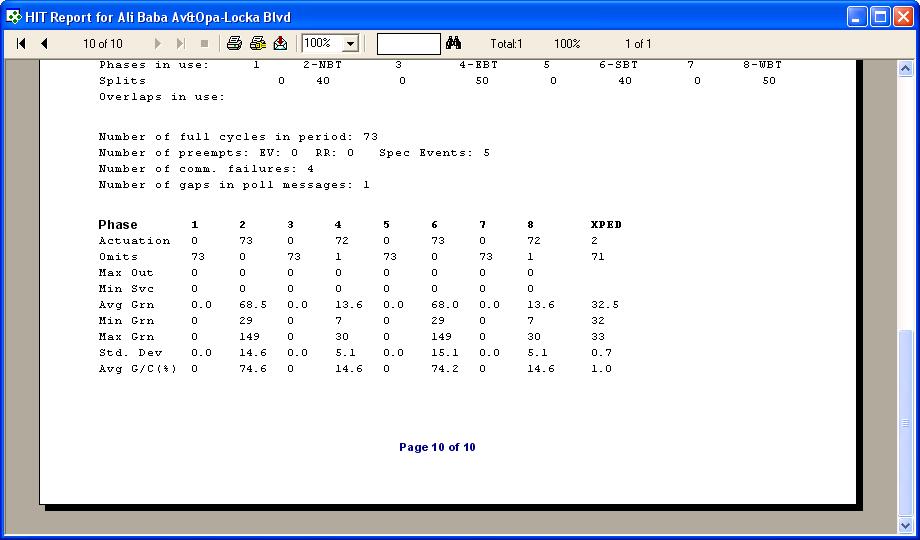
| Data Column | Description |
| Header Section | |
| Plan | The plan number |
| Start time | The start time and date of this timing plan period |
| End time | The end date and time of this timing plan period |
| Cycle | The programmed cycle time (in seconds) for this timing plan |
| Offset | The offset value for this timing plan, in seconds |
| Phases in use | The phase numbers and phase mnemonics of phases that are in use during this plan |
| Splits | The green + clearance time for this phase during this plan (in seconds) |
| Overlaps in use | The overlap numbers and mnemonics for any overlaps that are in use during this plan |
| Number of full cycles in period | The number of times that the controller cycled through all phases during this period (this does include cycles when one or more phases are skipped because of lack of traffic demand) |
| Number of comm. Failures | The number of cycles during this period during which a communications error was logged. Cycles when a communications error is logged are not used for calculating the statistics. |
| Number of gaps in poll messages | A gap is recorded when the frequency between two polls is greater than 10 seconds. |
| Statistics Section | |
| Actuations | The number of cycles that this phase was actuated during the plan period |
| Omits | The number of cycles that this phase was omitted during the plan period |
| Max Out | The number of cycles that this phase maxed out to terminate during the plan period |
| Min Svc | The number of cycles that this phase served its’ minimum time during the plan period |
| Avg Grn | The average green time for this phase during the plan period |
| Min Grn | The minimum green time for this phase during the plan period (not the programmed value, but a calculated value) |
| Max Grn | The maximum green time for this phase during the plan period (not the programmed value, but a calculated value) |
| Std Dev | The standard deviation of the green time for this phase during the plan period |
| Avg G/C | The average percentage of green time for this phase over the cycle time during the plan period, computed per ring. |
¶ Exporting data to clipboard
To export the detailed data to other applications, select the copy all button. This data can then be copied to any Windows program compatible with the Windows clipboard, notably any of the Microsoft Office applications as well as many others.

¶ Printing a report of just the data on the time-series graphic
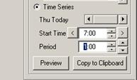
To print a report of just the data shown on the time-series graphic, select the preview button below the time-series selection controls. A printed report uses the KITS standard report format. The information shown on the report is exactly the same as the data described above, it just only covers the data displayed on the time-series graphic.
¶ Exporting data to clipboard
To export the data shown on the time-series graphic to other applications, select the copy to clipboard button. This data can then be copied to any Windows program compatible with the Windows clipboard, notably any of the Microsoft Office applications as well as many others.

¶ Printing the time-series graphics
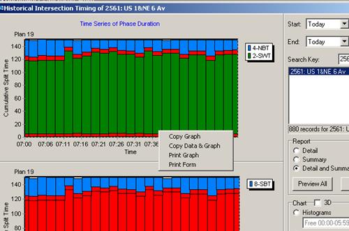
To print the time-series graphics, right-click on the graphic of interest and select the print control from the pop-up menu.
¶ Exporting / Copying graphics to the clipboard
To export the time-series graphic to other applications, right-click on the graphic of interest and select the copy control from the pop-up menu. This data can then be copied to any Windows program compatible with the Windows clipboard, notably any of the Microsoft Office applications as well as many others.

¶ Viewing Charts and Graphs
Below the selection buttons for printing and exporting the entirety of the HIT data that has been retrieved, you can manipulate the data that is displayed on the graphics. Two types of graphics are available:
- Histograms of phase durations
- Time-series of phase durations
By default, time-series displays are shown when any asset ID is selected.
¶ Time-Series Graphics
When starting the HIT report interface, the time-series graphics are automatically displayed starting with the selected start time of the data retrieval interval and continuing for a number of hours or minutes as selected in the interface box shown below.


The UI will remember the last settings selected and use that time duration the next time the UI is opened.
To change the start time of the graphic:
- Click in the hour or minute area of the time display and press the up arrow to increase the hour or minutes; press the down arrow to decrease the start time
- Type in a new hour or minute using the keyboard or number pad
To change the start day of the graphic
- Press the left arrow to choose an earlier day than the current selected day
- Press the right arrow to choose a later day than the current selected day
Note that a start day for the graphics earlier than the date returned in the top portion of the display cannot be selected. To select an earlier starting day than the day that is currently being retrieved, you first need to change the start day of the overall data-set in the top portion of the selection area.
¶ Time Series Graphics Display Area
The time series display shows the duration and clearance times of each phase on a dual-ring, eight-phase controller. The top portion of the display shows phases in ring 1 (phases 1, 2, 3, 4). The bottom portion of the display shows phases in Ring 2 (5, 6, 7, 8). Red is always used to show clearance times and time when that ring has a red indication. Other colors are used to distinguish one phase’s green time from another. Color designations are as follows:
| Phase | Color | Phase | Color |
| 1 | Light Green | 5 | Light Green |
| 2 | Dark Green | 6 | Dark Green |
| 3 | Yellow | 7 | Yellow |
| 4 | Light Blue | 8 | Light Blue |
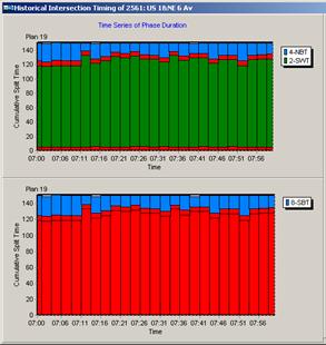
The x-axis indicates the time. Tick mark labels are automatically assigned at equal intervals based on the extent of the data being viewed. The y-axis is automatically scaled to indicate the maximum cycle time of the data being viewed. In most cases of coordinated operation, the colored bars should match the cycle time. When they do not, the controller could be in transition or in preemption.
When there is a lack of consistent communications, KITS cannot determine when a cycle starts and ends and what the phase timings actually were. In this case, the data is shown with a yellow highlight box around the cycle as shown below.
¶ Viewing histogram graphics
¶ Phase Duration Histogram Graphics
When starting the HIT report interface, the time-series graphics are automatically displayed, based on the settings in the lower right configuration box. To display histogram data by plan (including free), select the histogram radio button in the bottom-right configuration box.
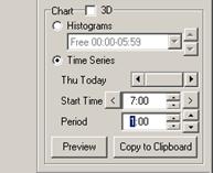
The UI will calculate the occurrence of each traffic plan for the duration selected in the start time and period configuration boxes.
To select a different pattern, select the desired pattern from the drop down box below the Histograms radio button.
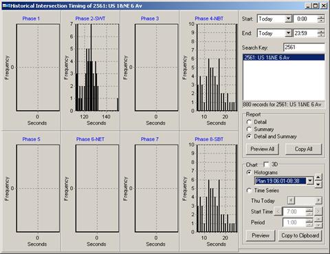

The histogram display shows a statistical view of the phase durations for an intersection during all of the cycles in the selected time period. Eight phase, dual-ring controllers are supported for display, so up to eight histograms are shown on the screen. The x-axis of each sub-graph is the time in seconds. Each sub-graph is automatically scaled based on the data observed for that phase. For phases that do not exist on the controller, the graph is auto-centered at zero (as shown above). The y-axis of the sub-graphs is the frequency of each phase duration. Taller bars indicate that this phase duration happened more frequently than the other phase durations in each cycle.
Each sub-graph heading is the configured phase number and phase mnemonic as configured in the database. In the example above, phases 2, 4, and 8 have durations for plan 19 at the selected time (6:00am to 7:38am).
¶ Printing a report of just the data on the histogram graphic
To print a report of just the data shown on the histogram graphic, select the preview button below the time-series selection controls. A printed report uses the KITS standard report format. The information shown on the report is exactly the same as the data described above, it just only covers the data displayed on the time-series graphic.
¶ Exporting data to clipboard
To export the data shown on the histogram graphic to other applications, select the copy to clipboard button. This data can then be copied to any Windows program compatible with the Windows clipboard, notably any of the Microsoft Office applications as well as many others.
¶ Printing the histogram graphics
To print the histogram graphics, right-click on the graphic of interest and select the print control from the pop-up menu. This works exactly the same as the function for the time-series graphics.
¶ Exporting / Copying graphics to the clipboard
To export the histogram graphic to other applications, right-click on the graphic of interest and select the copy control from the pop-up menu. This data can then be copied to any Windows program compatible with the Windows clipboard, notably any of the Microsoft Office applications as well as many others.

¶ Right-Click Menu for HIT Report
Right-click on the HIT report graph to access the following options as shown below:
| Option | Description |
| Copy graph | Copy the graph data to the Windows clipboard. Can be paste into other applications using Ctrl-V or Paste. |
| Copy data and graph | Copies both the underlying data and the graph to the clipboard. Can be paste into other applications using Ctrl-V or Paste (typically Excel) |
| Print Graph | Print the graph that is currently being right-clicked on |
| Print form | Print a graphic of everything on the form including both graphs and the settings on the right-hand side |
| Cycle Summary | Open the cycle summary display for this intersection |
| Phase malfunction report | Open a phase malfunction report selection dialog |
| Set Default Time | Sets the current start and end settings as the default settings. If the HIT report interface is re-opened, these settings are retained. |